Pearsons Florist
It’s fair to say that florists understand the importance of keeping things fresh.
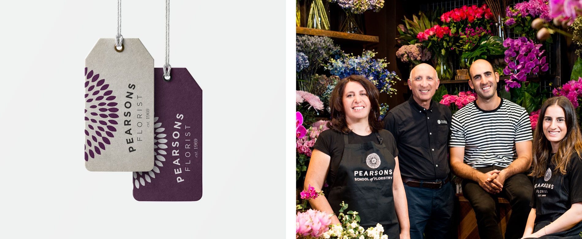
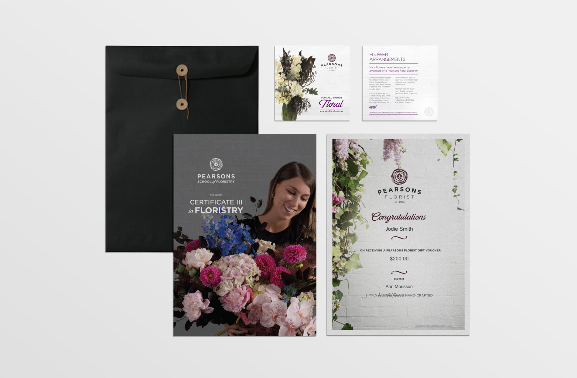
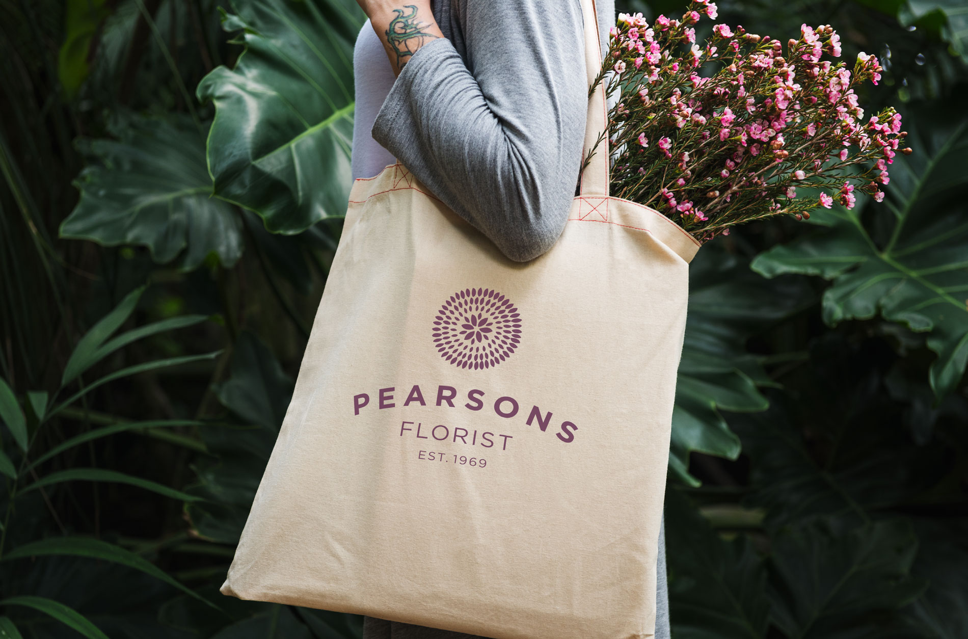
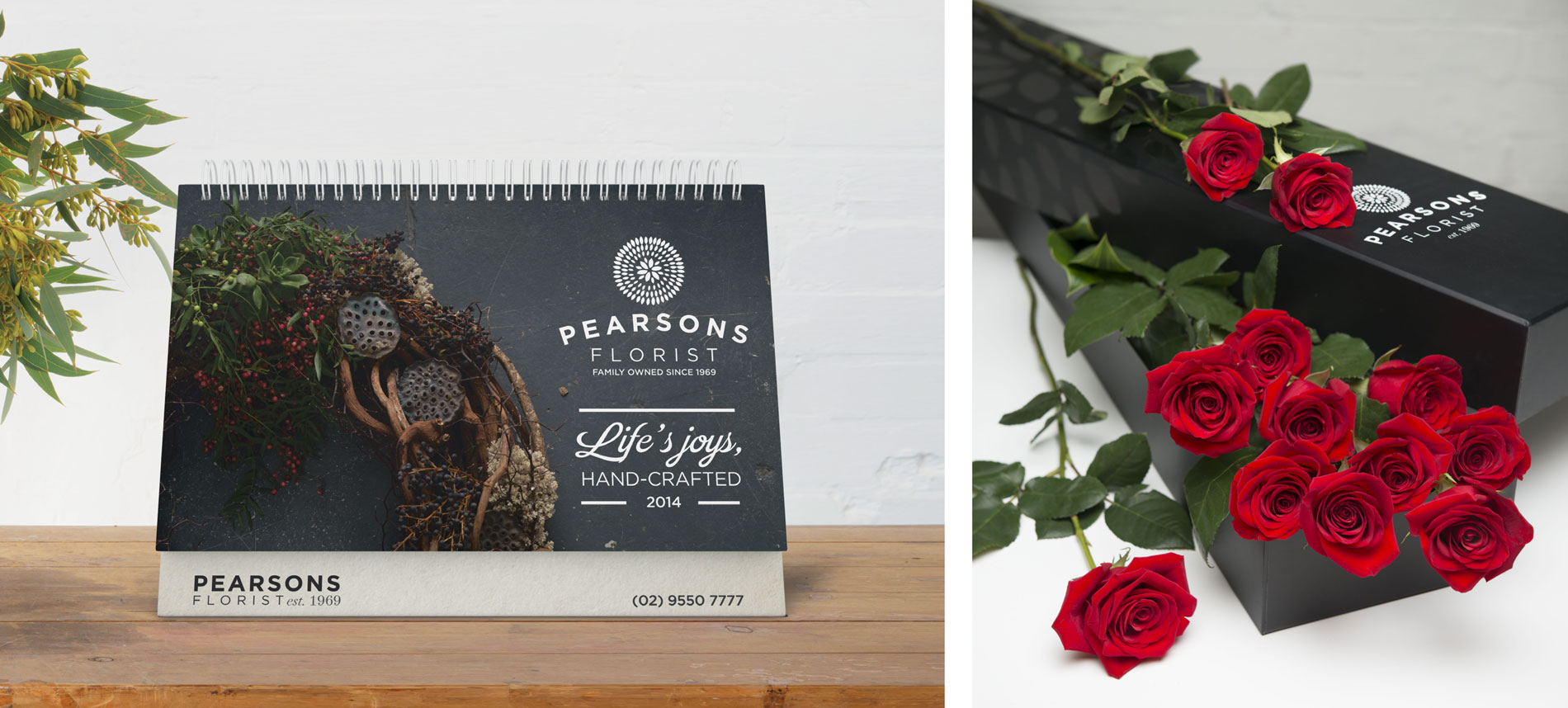
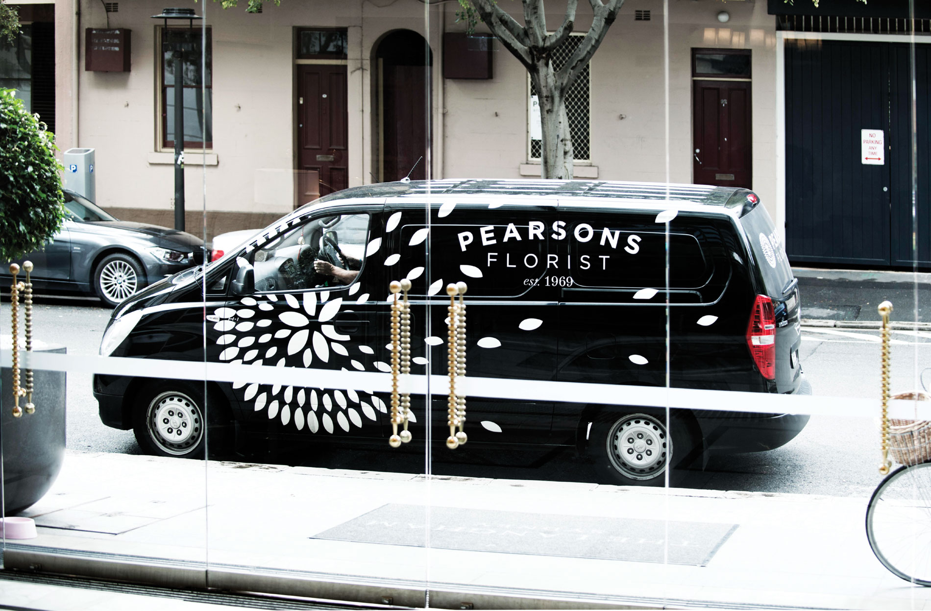
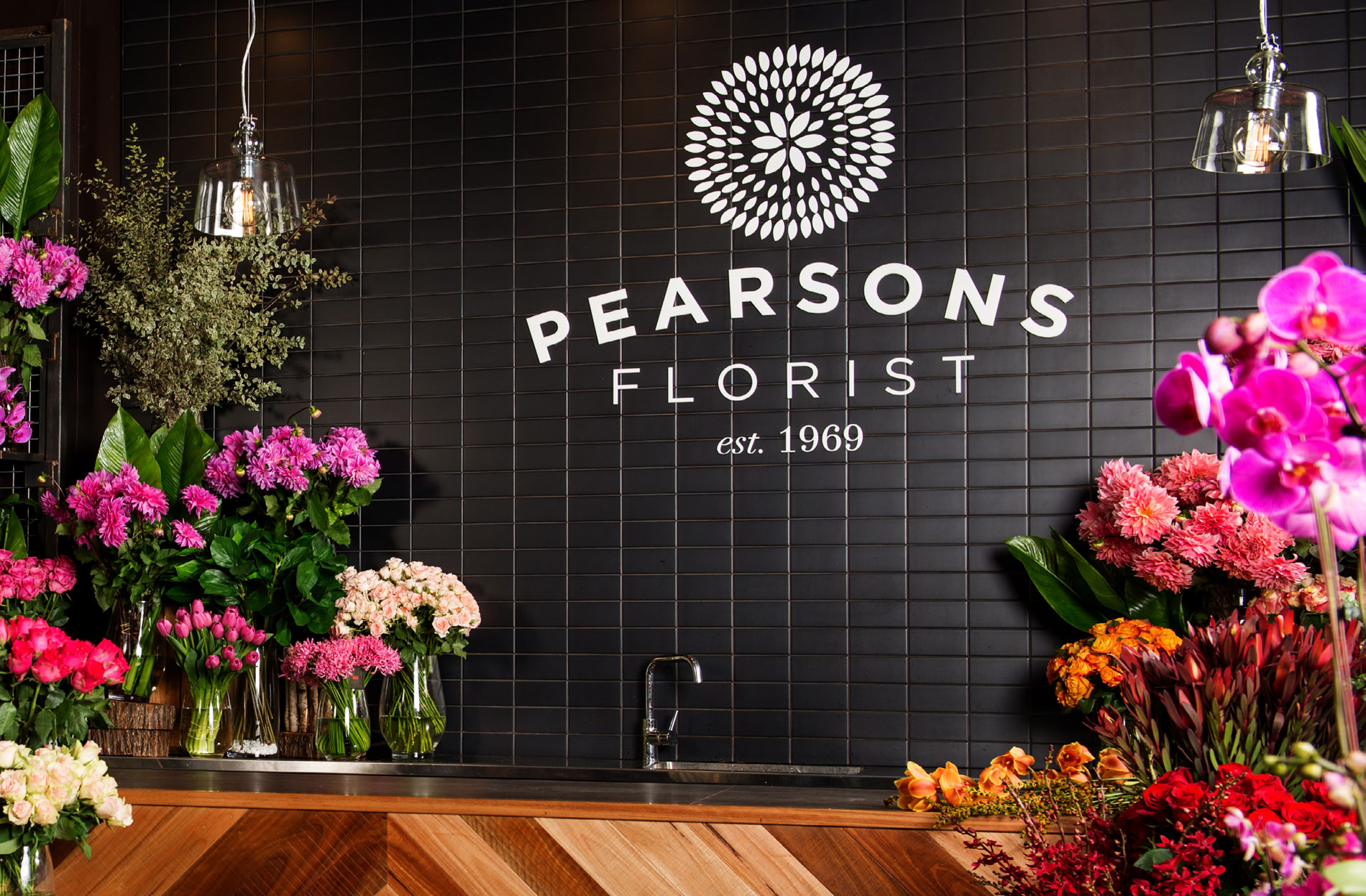
Sydney’s beloved Pearson’s Florist was established over 50 years ago, and has been family owned and operated from the get go through to today. But the company had used the same logo and branding for decades, and although there was great equity in the visual identity, it was a tad tired. It needed some serious plant food, a nice watering and some UV rays.
We believe that when a brand has a heritage and there is consumer loyalty, there needs to be observation, recondition and respect for what has been. Consumers familiar with and loyal to a brand need to know it’s the same people delivering the same great product and service.
This was how we approached the Pearson’s rebrand. We took note of what had been, and brought an updated contemporary, whilst still classic, look and feel to an already strong identity.